After two rounds of refinement, the overall experience of the app has improved significantly. Now I can focus my efforts towards developing the brand identity and visual identity.
Brand Development
To keep visual elements consistent, I came up with a list of adjectives to describe the visual experience of the brand. These are words that I believe my interviewees and Rochelle would resonate with.
More approachable than formal
More brave than timid
More contemporary than traditional
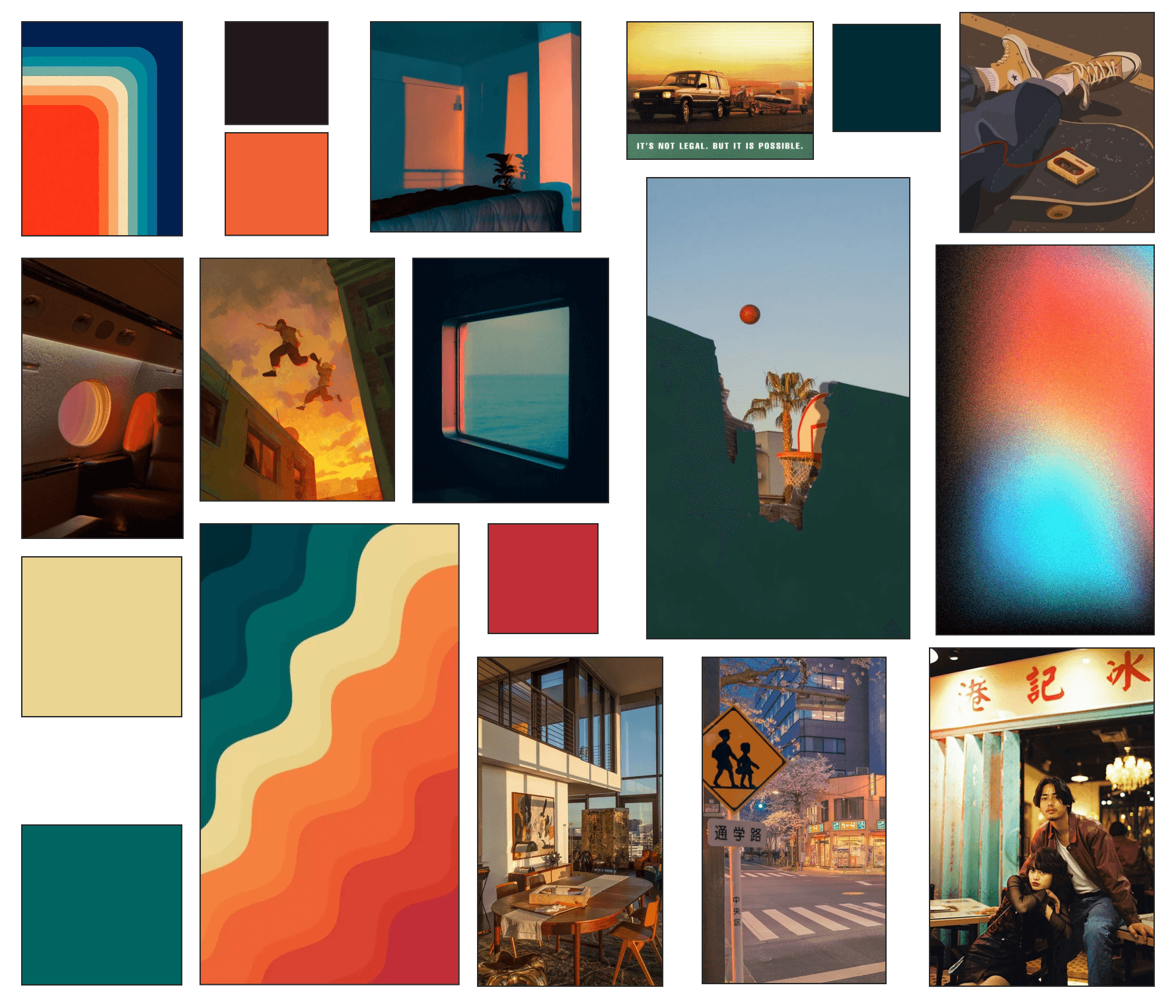
I brought these brand adjectives and descriptors to life in the form of a mood board, which will help guide the other visual components of the brand.
Moodboard
Discovery
Empowering
Bold
Trust
Welcoming
Innovative
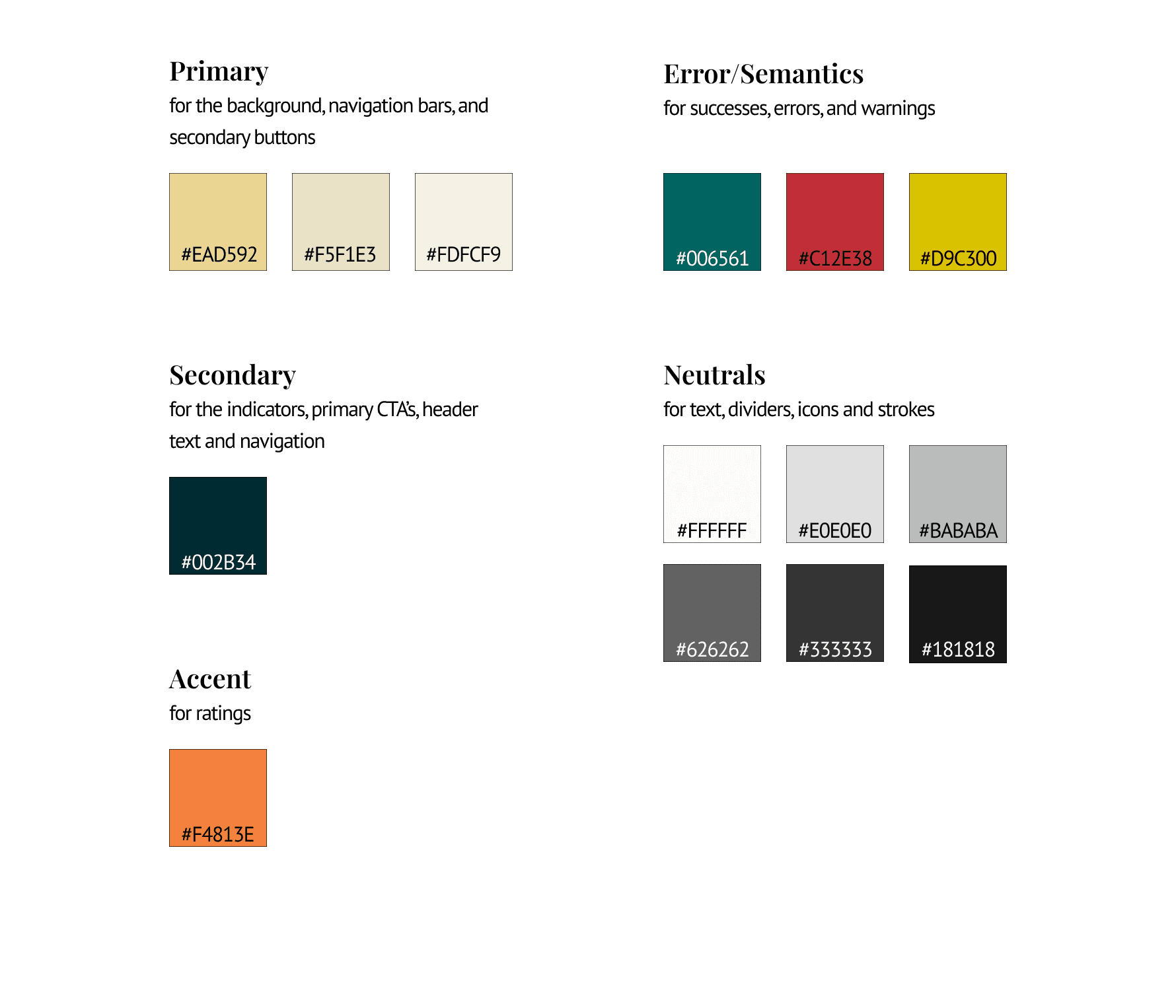
The final brand colours were extracted from the moodboard. There were far too many colours to use, so I decided to choose three colours and follow the 60/30/10 rule.
Brand Colors
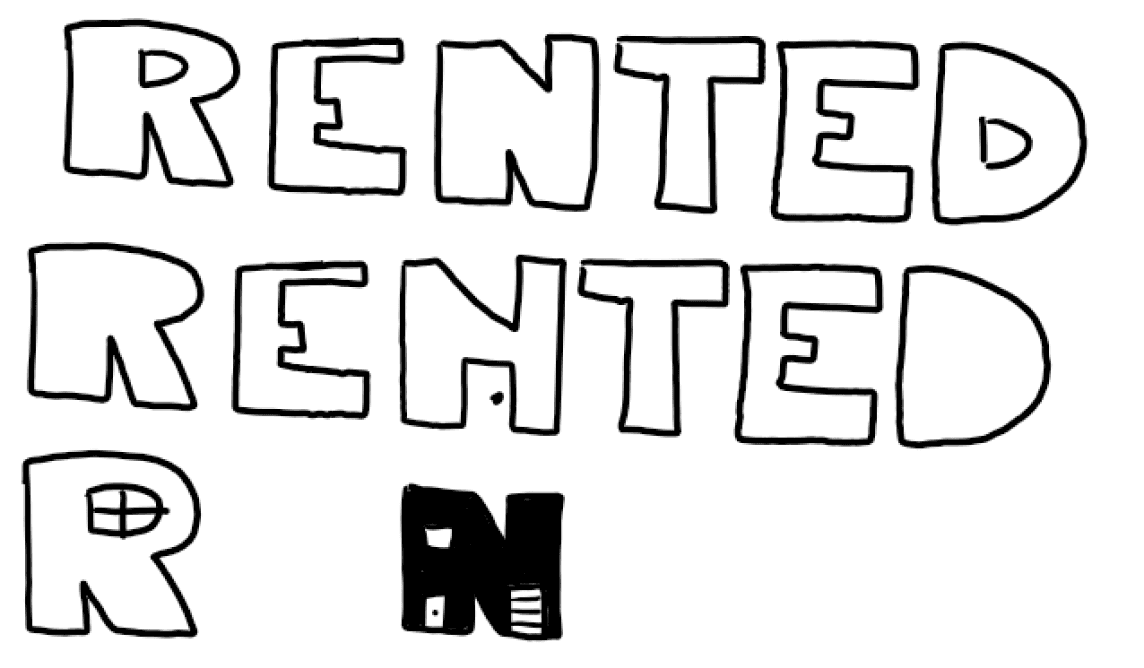
After generating over 15 different naming options, I settled on the brand name Rented. Rented is short, clearly associated with the act of renting, and also provocative for people because it’s in the past tense.
Brand Name Exploration
To build on these words, I also generated a few prompts to help clearly define the visual nature of the app.
Brainstorming Phase
Rented
Rented By
Sublet
Lease
Trusted Home
Back to back
New Homes
Dwelling
Den
ClearDen
Vacancy
Moving
Housing
Tipster
Canary
Rented
Final Name
After selecting a brand name, I started the process of developing the wordmark. I created an inspiration board, sketched some ideas, and decided that I needed a font that was thick and slightly stylized.
Finally, I settled on Bungee as the typeface. I believe that Bungee strongly communicates my adjectives of bold, innovative, empowering, and trust.
For my secondary typeface, I’ll be using Poppins. Its bold and contemporary style will help my headers stand out from the body copy.
Finally, I developed a UI library based on Brad Frost’s atomic design system. This tool will be valuable to help maintain visual consistency across the different components. As well, it will help in the handoff process to developers.
To view the UI Library, please click here.
UI Library
v1
v2
v3
Hi-Fidelity
Initial Sketch
I wasn’t completely satisfied with the wordmark yet, so I vectorized the wordmark and made the individual letters thinner. As well, I played around with the visual elements and eventually added a roof and chimney to add visual interest to the wordmark.
Finalized Wordmark
For the primary typeface, I’ll be using Source Sans Pro. Visually, its minimalistic and clean style will give users an easy time reading any body copy in the app.
Typography
abcdefghijklmnopqrstuvwxyz
abcdefghijklmnopqrstuvwxyz
1234567890
abcdefghijklmnopqrstuvwxyz
abcdefghijklmnopqrstuvwxyz
1234567890
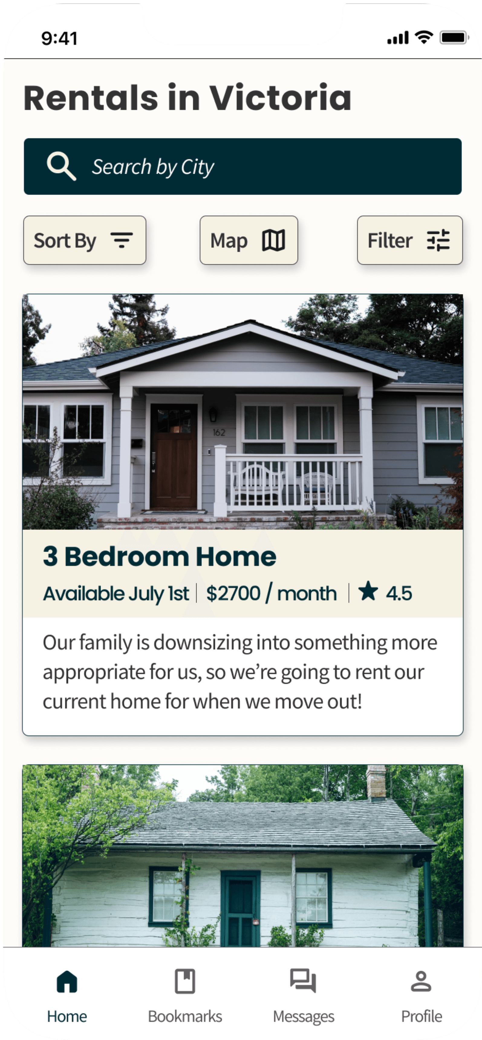
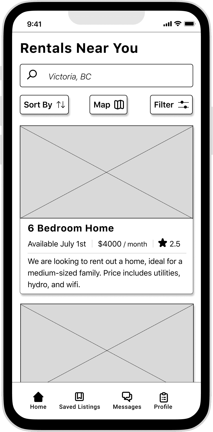
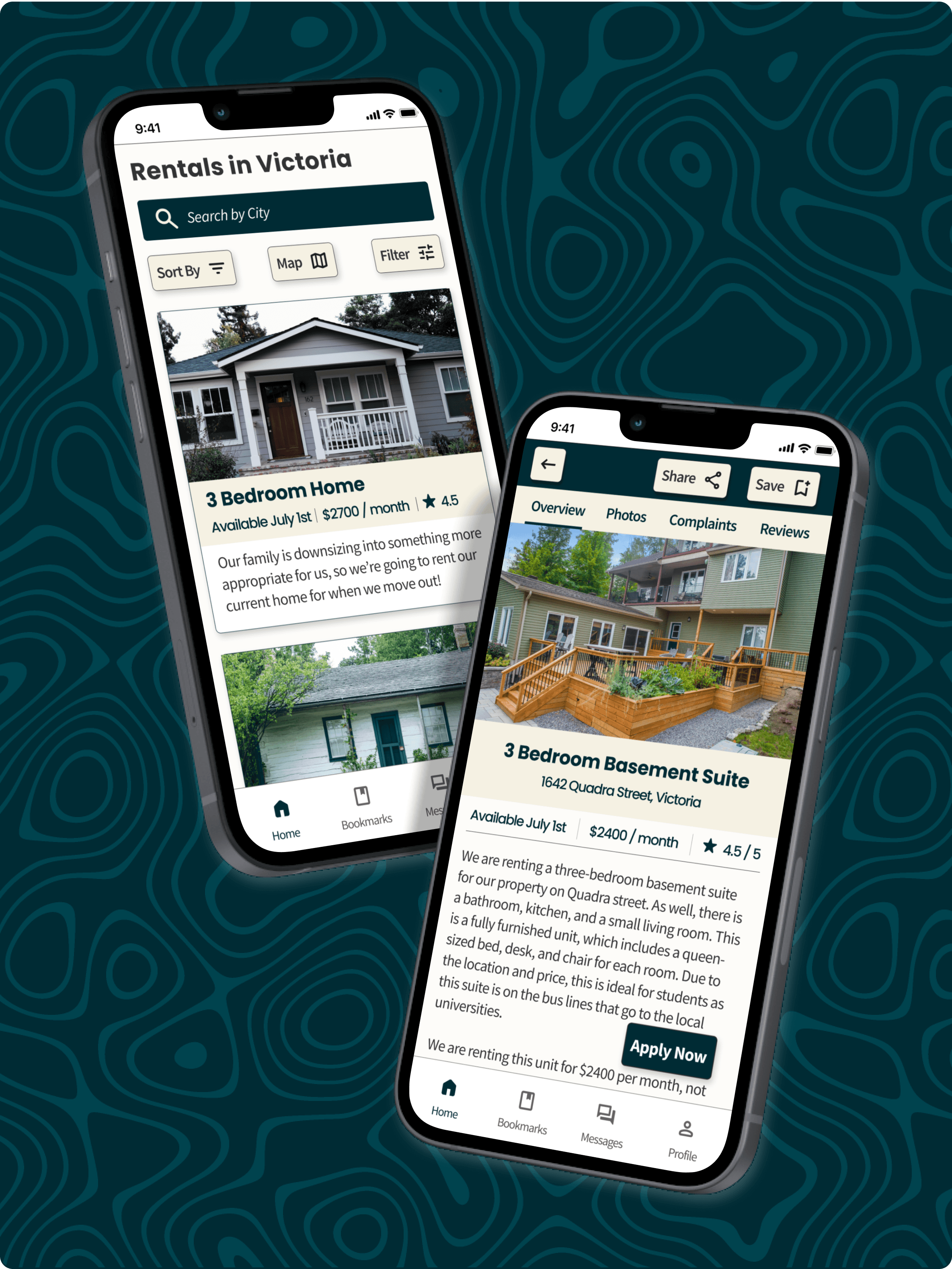
With my visual identity completed, I applied every element to my wireframes. It looks fantastic (in my humble opinion).
To view the hi-fidelity prototype, please click here.
Hi-fidelity Prototype
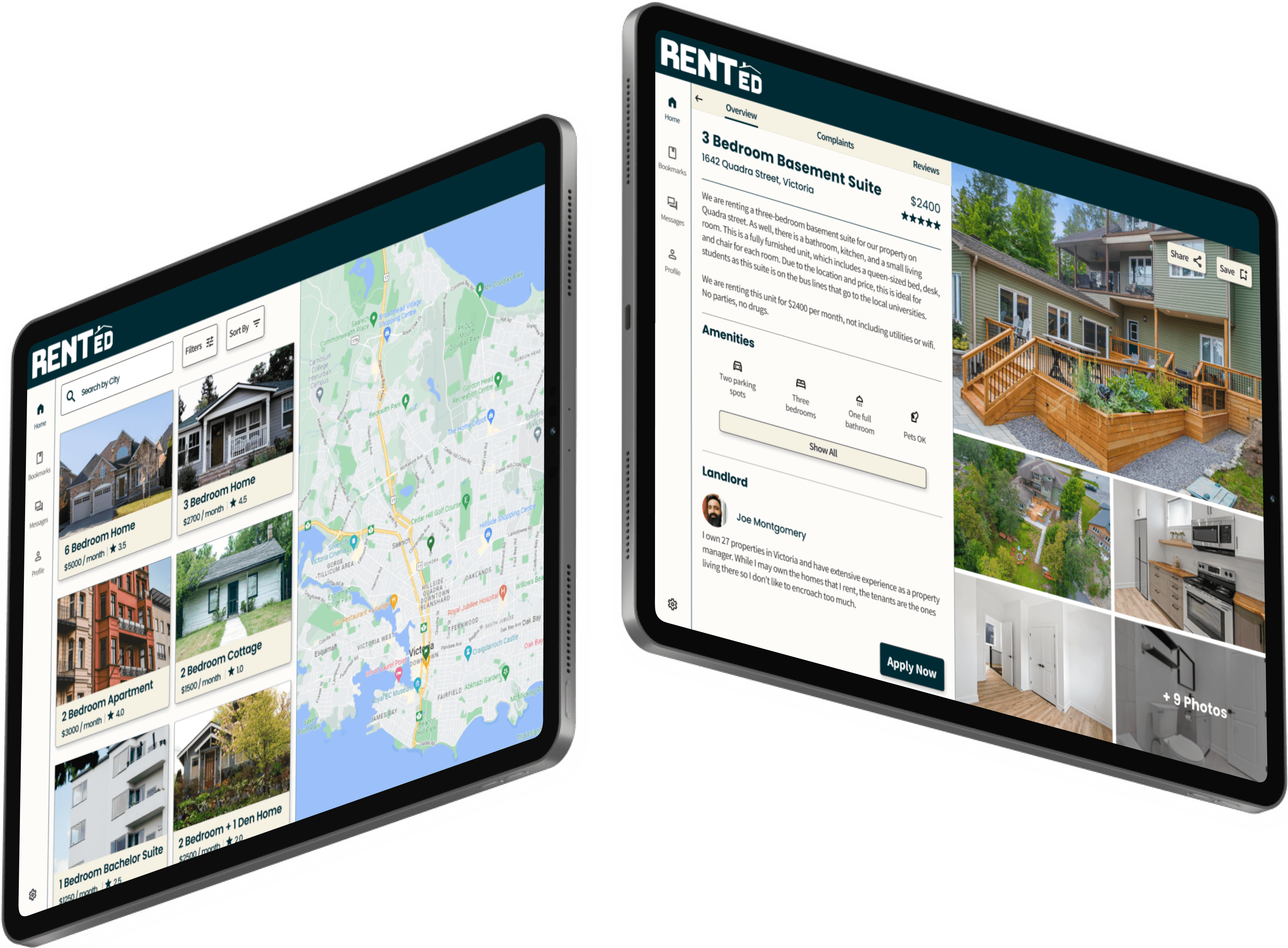
Alongside my hi-fidelity mobile prototype, I also developed a version of Rented for tablets. This gives users even more options to access the app.
Multi-Platform
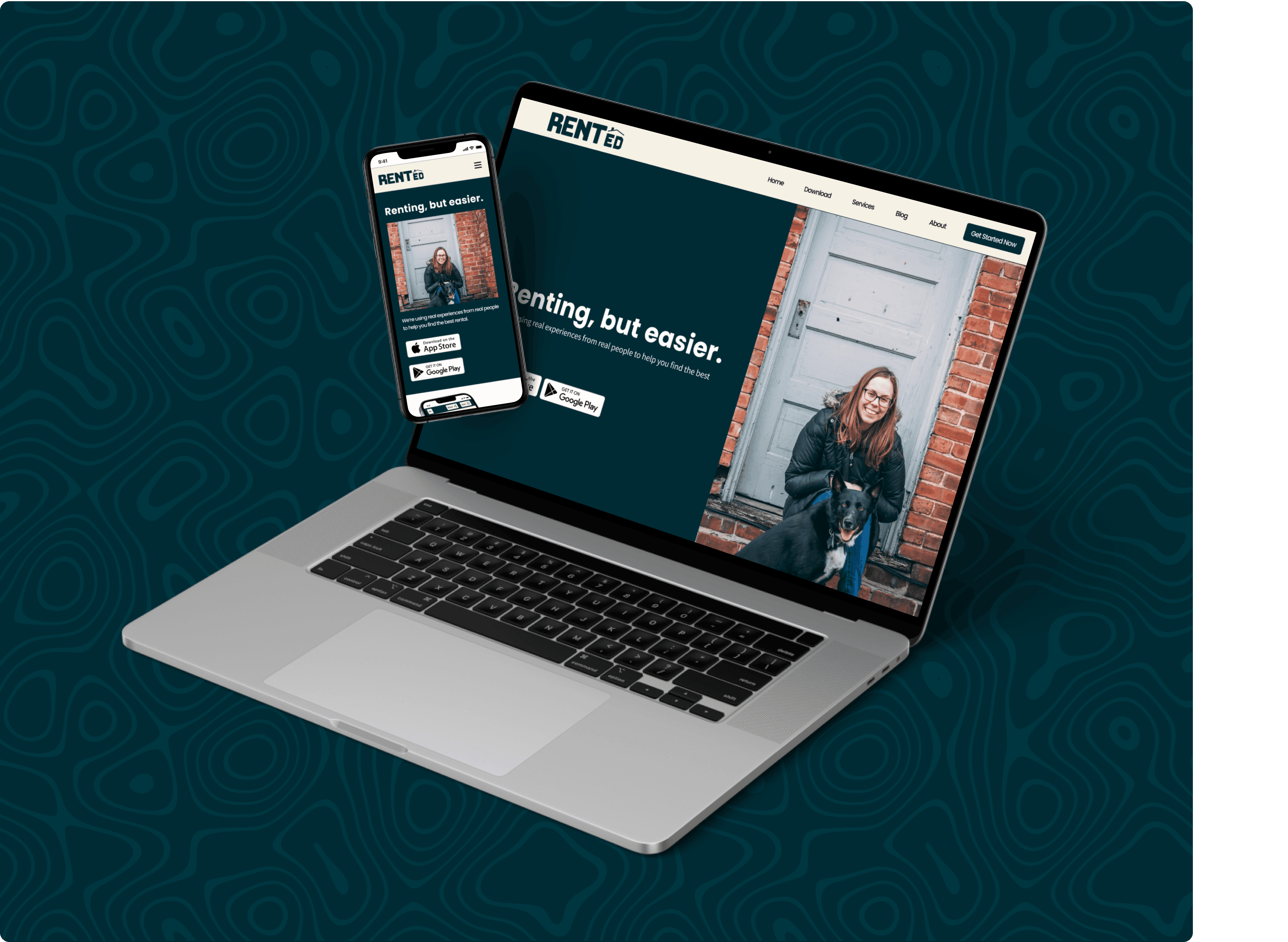
Finally, I built a responsive marketing website that promotes Rented. Accessible on phones, tablets, and laptops, this website communicates the value proposition of the app to new users.
To view the responsive marketing website, please click here.
For the mobile experience, please click here.
Marketing Website
Design Challenge
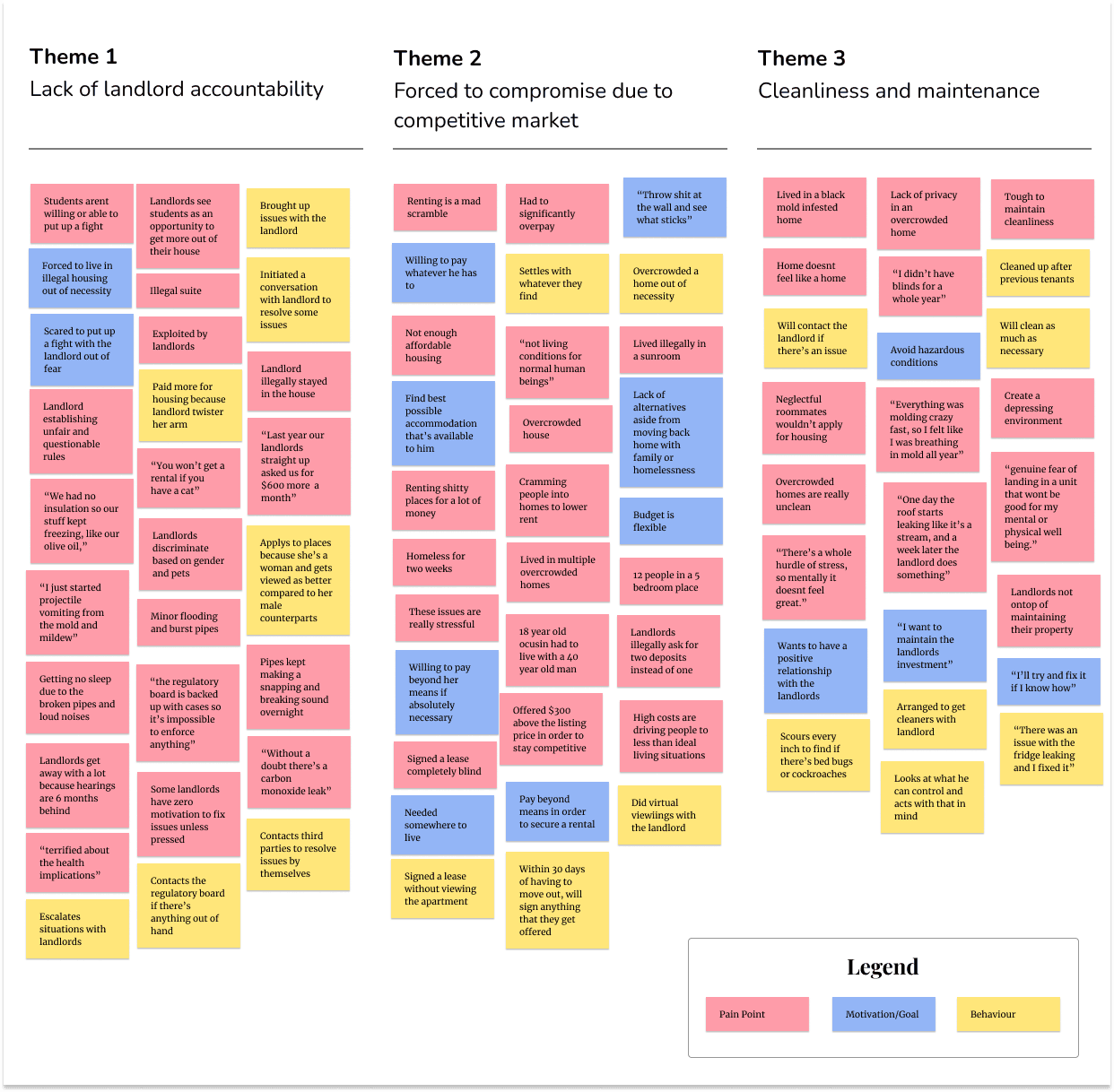
Affinity Mapping
Interviewing Kyle, Rebecca, and Rory gave me some crucial insights into what it's like to rent as a young adult. I organized all of these interview findings by sorting them into pain points, motivations, and behaviors. Based on insights gathered from the interviews, three key themes emerged from the affinity mapping process.
Problem Statement
Major cities across Canada lack adequate housing for their populations. This is especially true for younger people, who are being asked to pay more for less as they move into dangerous, if not downright illegal rental units. By doing so, people are putting their own well-being at risk.
Secondary Research
There isn't enough housing in almost all major cities across Canada. This lower supply has resulted in rent prices skyrocketing over the past few years. For younger people who are just getting started in their first jobs or entering school, it leaves them in a difficult position.
User Interviews and Insights
To gather more insights, I interviewed three Canadians between the ages of 18-25 to learn more about their experiences as renters in some of the country's hottest markets. These sessions lasted between 30-60 minutes and were conducted over Zoom.
Key Insights
Based on insights gathered from the interviews, three key themes emerged from the affinity mapping process. While each theme presents its own set of challenges, I decided to pursue the theme of landlord accountability. It was clear to me that the biggest painpoints stemmed from this theme.
Poor Cleanliness and
Maintenance
Insight: Without the means or ability to rent nicer places, young adults are often renting dirty or hazardous homes. They are often putting their own physical and mental health at risk by doing so.
Lack of Landlord
Accountability
Insight: Landlords are taking advantage of young adults by treating them unfairly and exposing them to dangerous, if not illegal housing situations because they know they wonn’t be held accountable.
Forced to Compromise
Insight: Young adults are compromising a lot when it comes to their rental situations. Whether it’s paying much higher rent, settling for a home in terrible condition, or overcrowding their homes to lower rent, they’re doing whatever they can to secure housing.
3.4%
is the national vacancy rate across Canada.
The lower the vacancy rate, the more likely that there's less supply to match demand, resulting in increased rental prices.
Kyle, a 25-year-old Urban Planner living in Toronto, tells me about his experience living in an apartment with a gas leak. The landlord didn't resolve this for months, which will likely leave him with long-lasting health issues.
Rebecca, a 23-year-old Master's Student living in Victoria, shares a story of when her landlord illegally stayed in her home with her, forcing her to leave and become homeless for two weeks.
Rory, a 24-year-old Groundskeeper living in Victoria, recounts his experience living in an illegal suite that was formerly a garage, where electrical fires were common.
How might we improve the rental process for young Canadians between 18-25 to help them avoid dangerous living conditions?
1.5million
people moved back in with their parents in 2020. For those without the option, where does that leave them?
15.4%
is how much rent, on average, has increased across Canada since September 2021.
With a strong understanding of the problem space, I developed a user persona and experience map. These two artefacts will help guide me in exploring and creating a solution that can alleviate the target user's pain points.
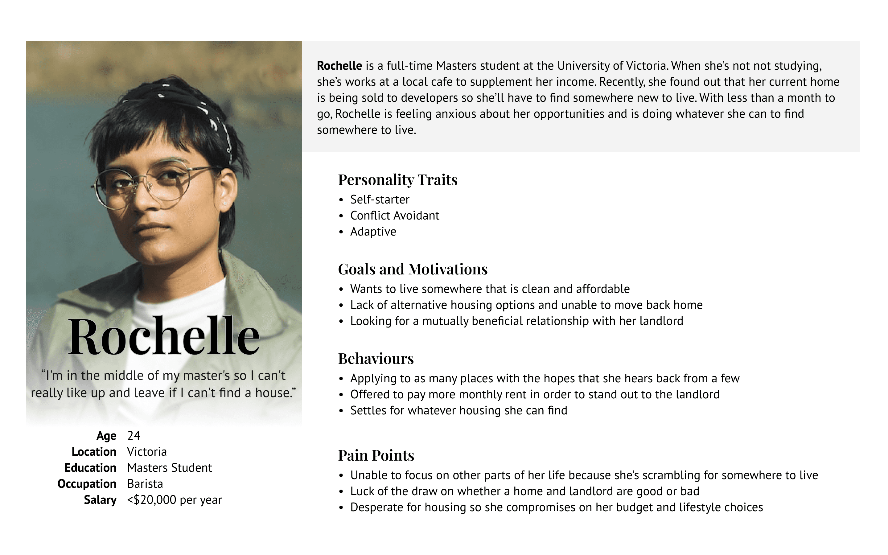
Persona
Inspired by my interviewees, secondary research, and selected theme, I created Rochelle. Rochelle represents my target user - a young adult struggling to find somewhere to rent as she completes her master's degree. Her past experiences dealing with slimy landlords have left a lasting impact on her.
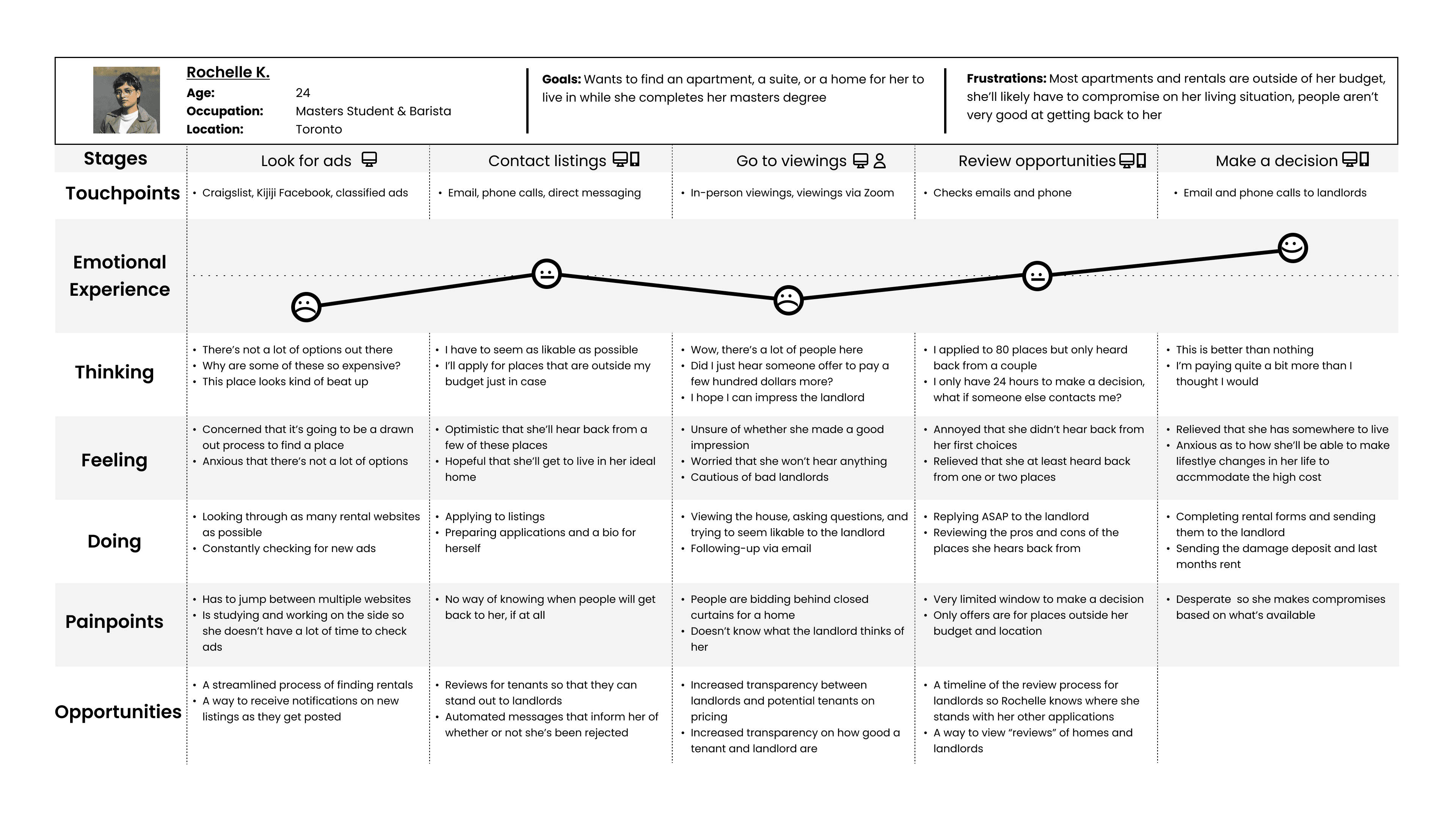
Experience Map
With Rochelle, I wanted to build an experience map to help me visualize, and more importantly, empathize with her experience of finding a rental. Each step represents a pivotal moment in the process. From here I’ll be able to find opportunities in the experience map and subsequently intervene with a solution.
Rochelle and the visualization of her experience of looking for somewhere to live are crucial to helping me design a focused solution. From here, I’ll start ideating different functions that could help alleviate Rochelle’s pain points. I’ll be doing this in the form of user stories, which will then be sorted into overarching epics.
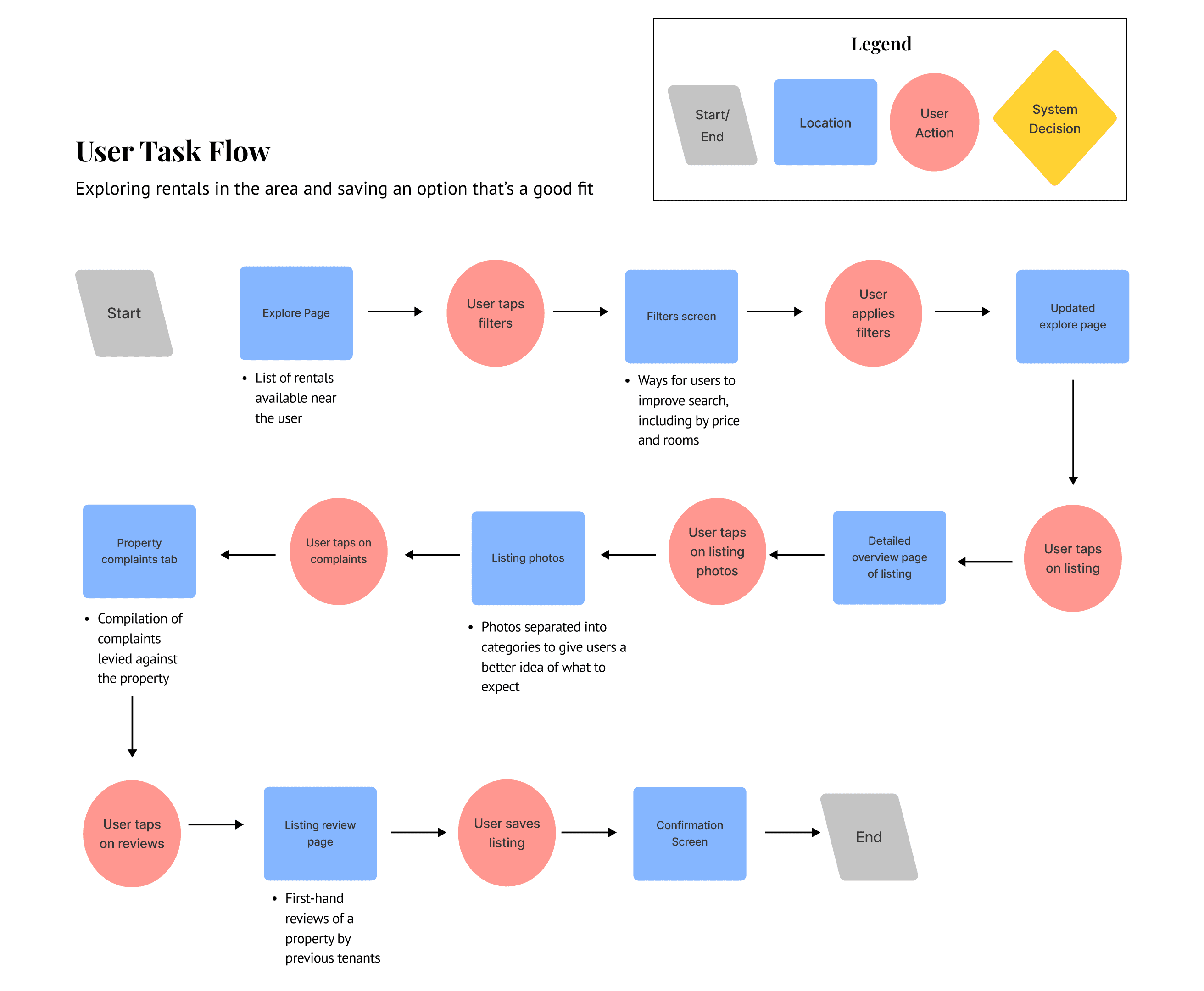
Task Flow
With 10 user stories to work with, I began brainstorming what a potential task flow could look like for Rochelle. I decided that the task flow would focus on the process of Rochelle searching for a rental through a mobile app and saving a listing once she found one that met her needs.
User Stories, Tasks and Epics
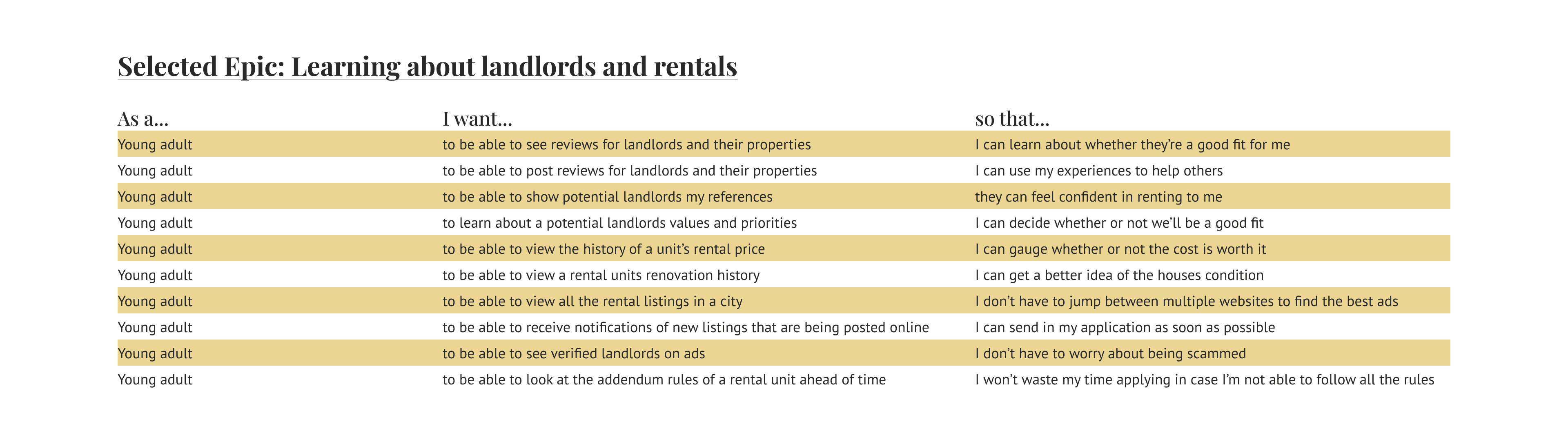
Through an extensive ideation process, I brainstormed 22 unique user stories which then fit into five different epics. This includes: learning about landlords and rentals, sending and tracking applications, price tracking, safety assessment, and roommate finding.
While each of these epics would address one of Rochelle’s pain points, I decided that Learning about Landlords and Rentals seemed the most pressing to explore.
I’m biased. That’s why I need other people to check and verify my work. At this stage, I wanted to test my prototype to uncover potential improvements and address any glaring mistakes.
After finishing my first prototype and feeling good about myself, it was time for me to come back down to earth. It was time for me to test my app and subsequently lose my ego. Over two rounds, I tested 10 people between the ages of 18-25 in North America, who identified as active renters.
After each round, I would sort any feedback I received alongside my observations on a prioritization matrix. Due to time restraints, I made changes to things in the low-effort/high-value quadrant.
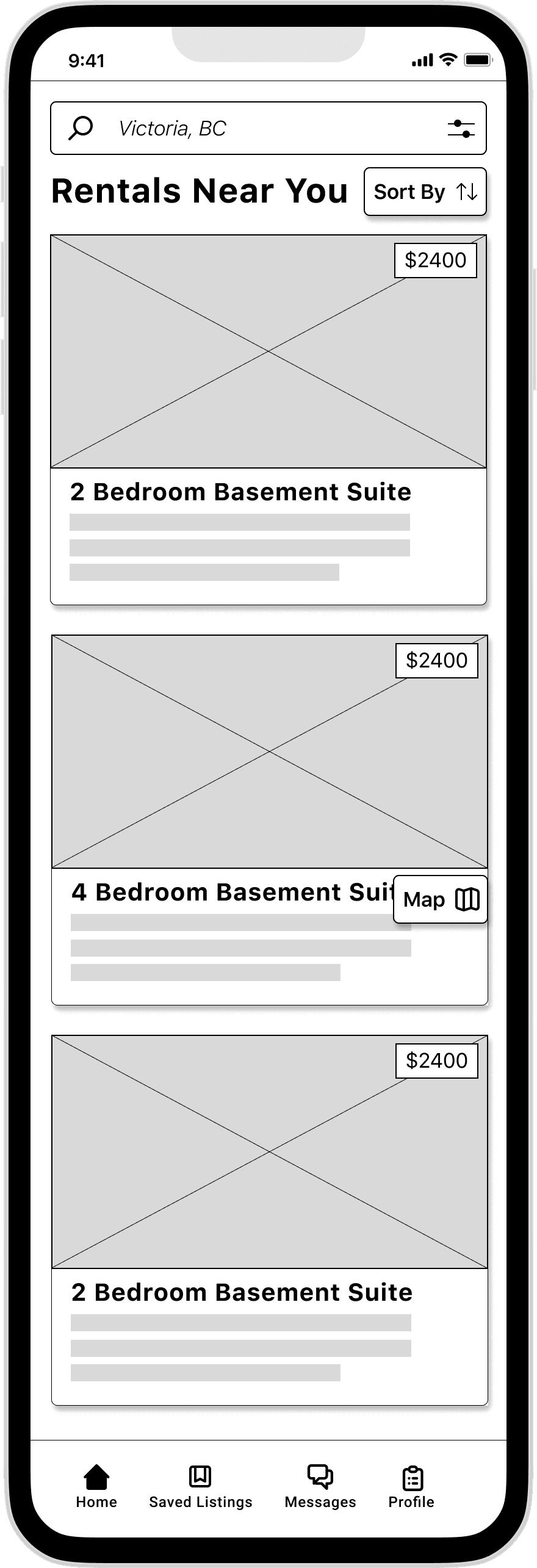
User Testing
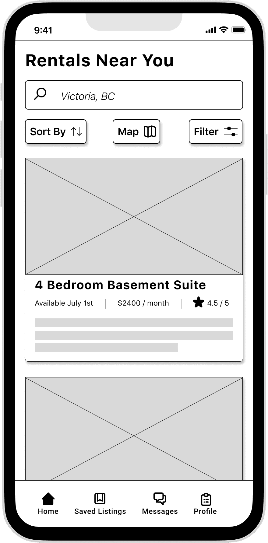
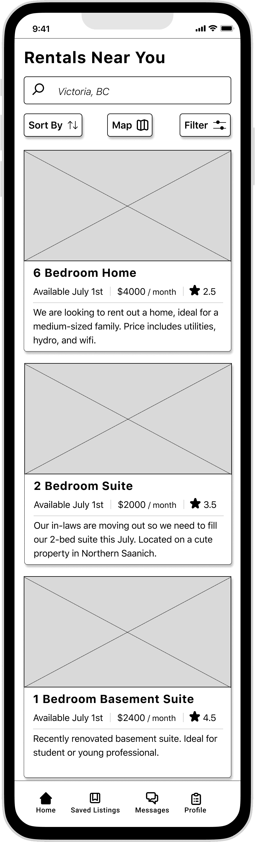
Explore Screen
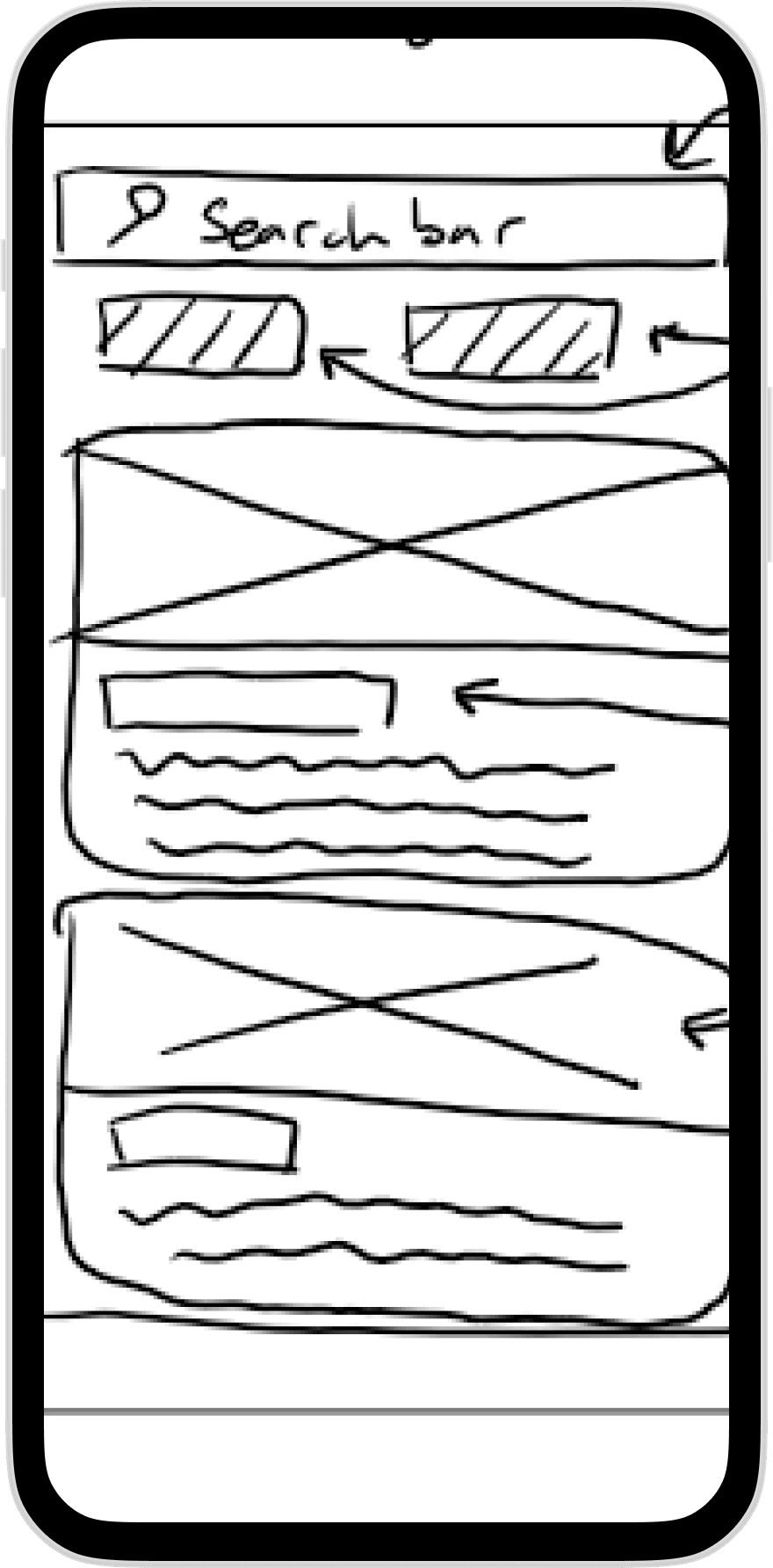
Added important info (such as rating) to listing tile
Moved all the buttons to underneath the search bar
Gave the filter a more distinct button
The hierarchy of information could be drastically improved
Lack of navigation options for people to jump between pages
Some buttons weren't intuitive, likely because they didn't fit people's mental models
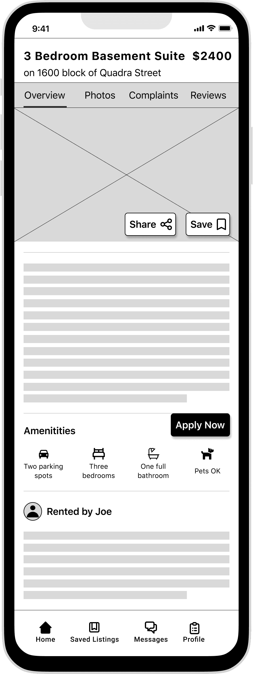
Round One: Observations, User Feedback & Design Changes
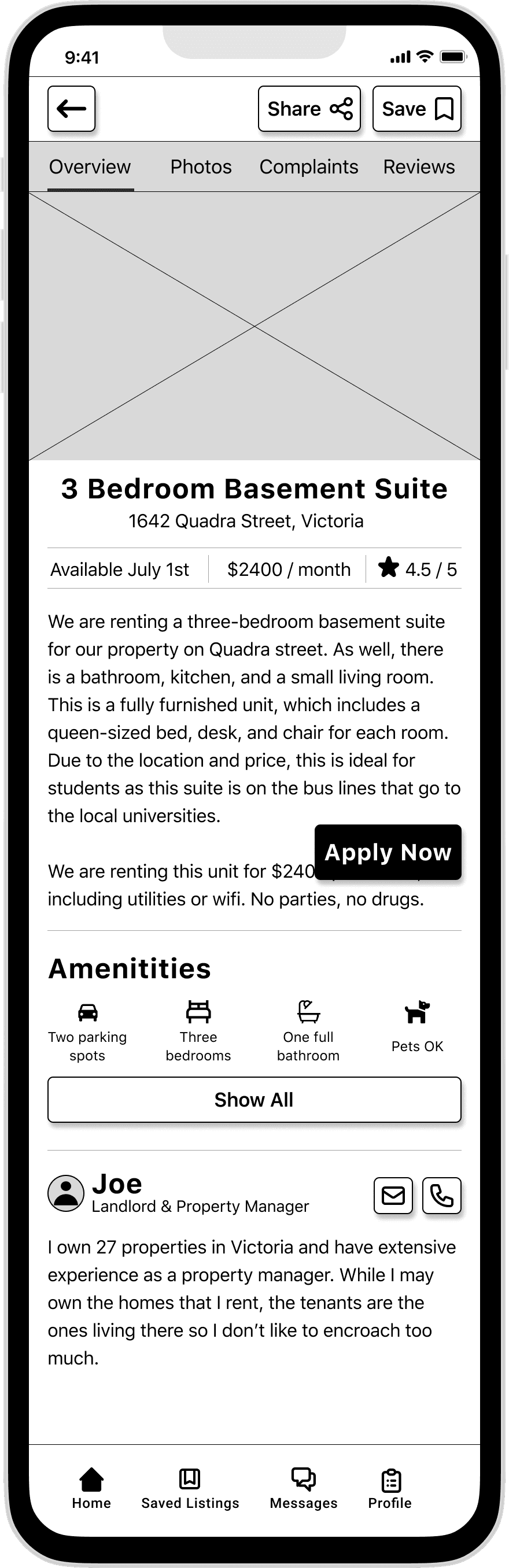
Listing Screen
Moved the secondary buttons to the top
Improved hierarchy of information by moving key details to beneath the images
Increased the size of the apply button
While better, there are some elements to the hierarchy of information that can be improved
It wasn't clear what the purpose of the landlord section was
Universal elements such as type styling, icons, and spacing were optimized
Added body copy to V3
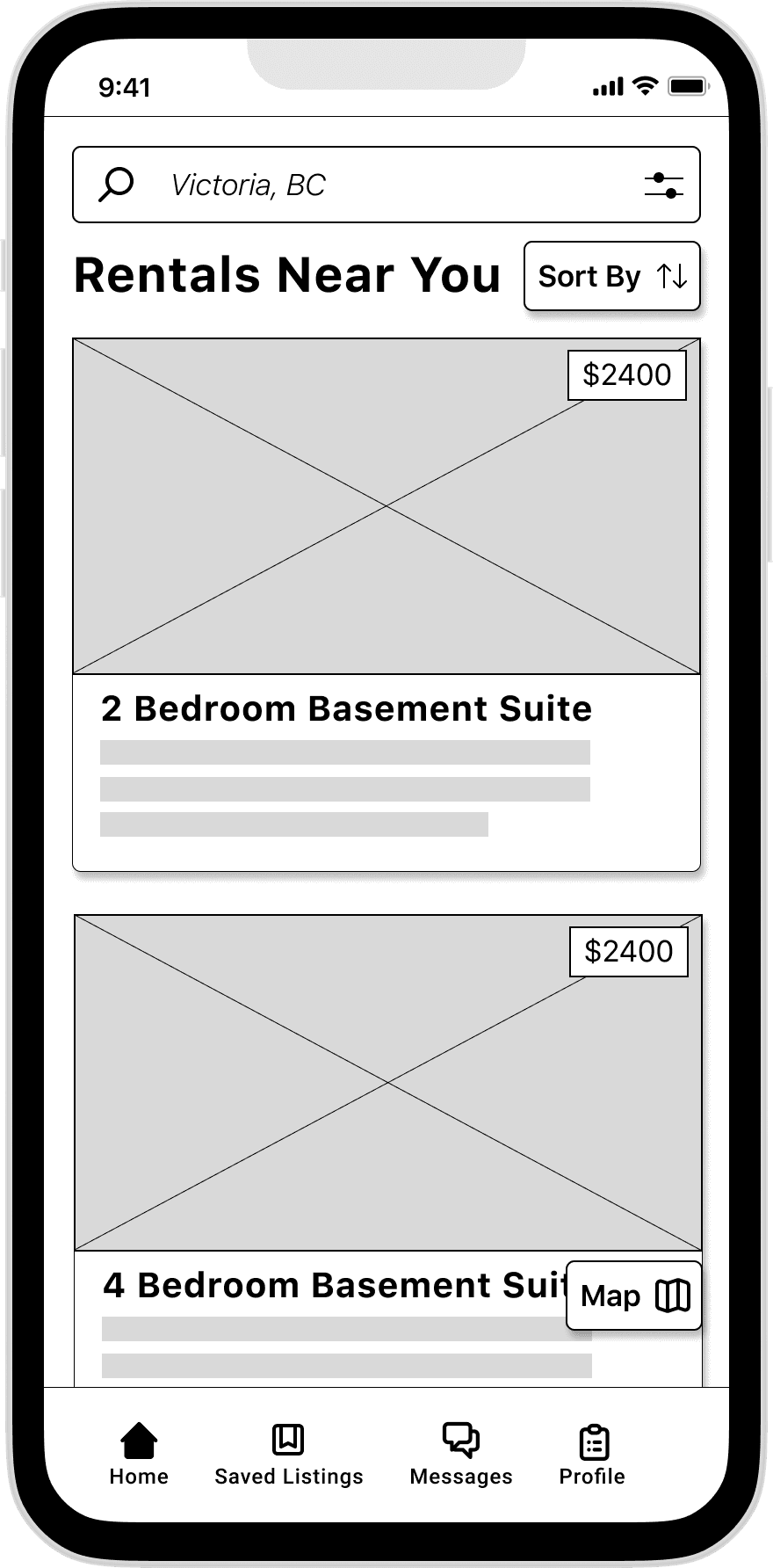
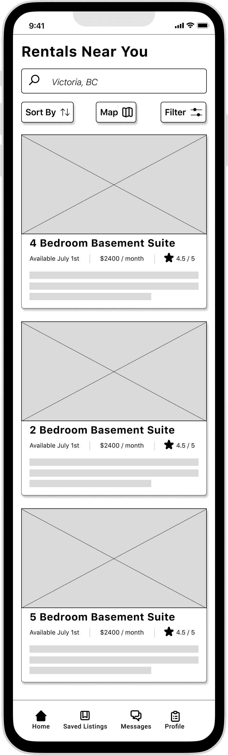
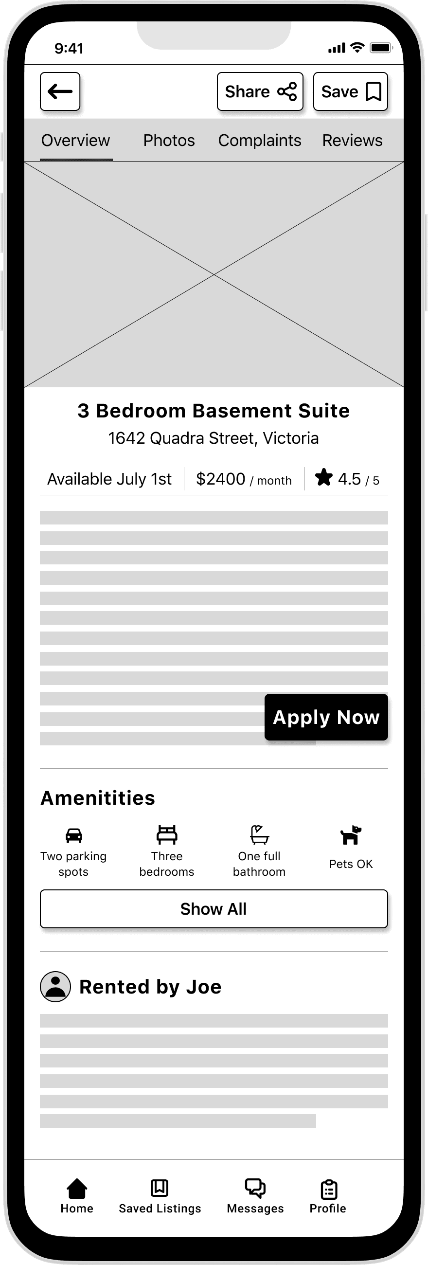
Round Two: Observations, User Feedback & Design Changes
Explore Screen
Improved the font size of key details to improve legibility
Listing Screen
Added additional details to the landlord profile
Added contact options to the landlord profile
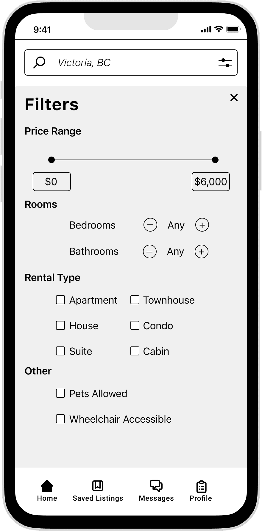
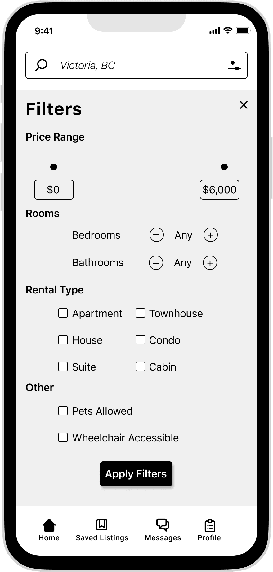
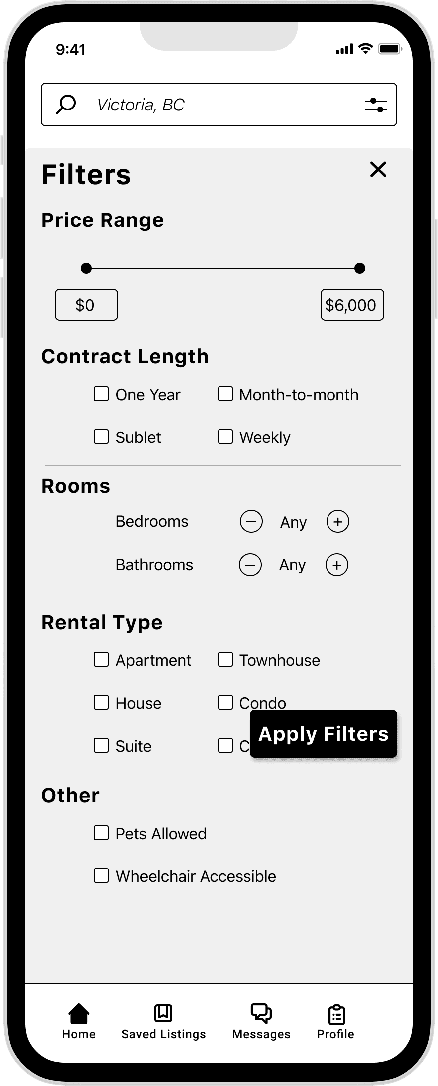
Filter Screen
Adjusted the apply button to be more consistent with the apply button on the listing page
Added additional filters for contract length
v2
v3
v2
v3
v2
v3
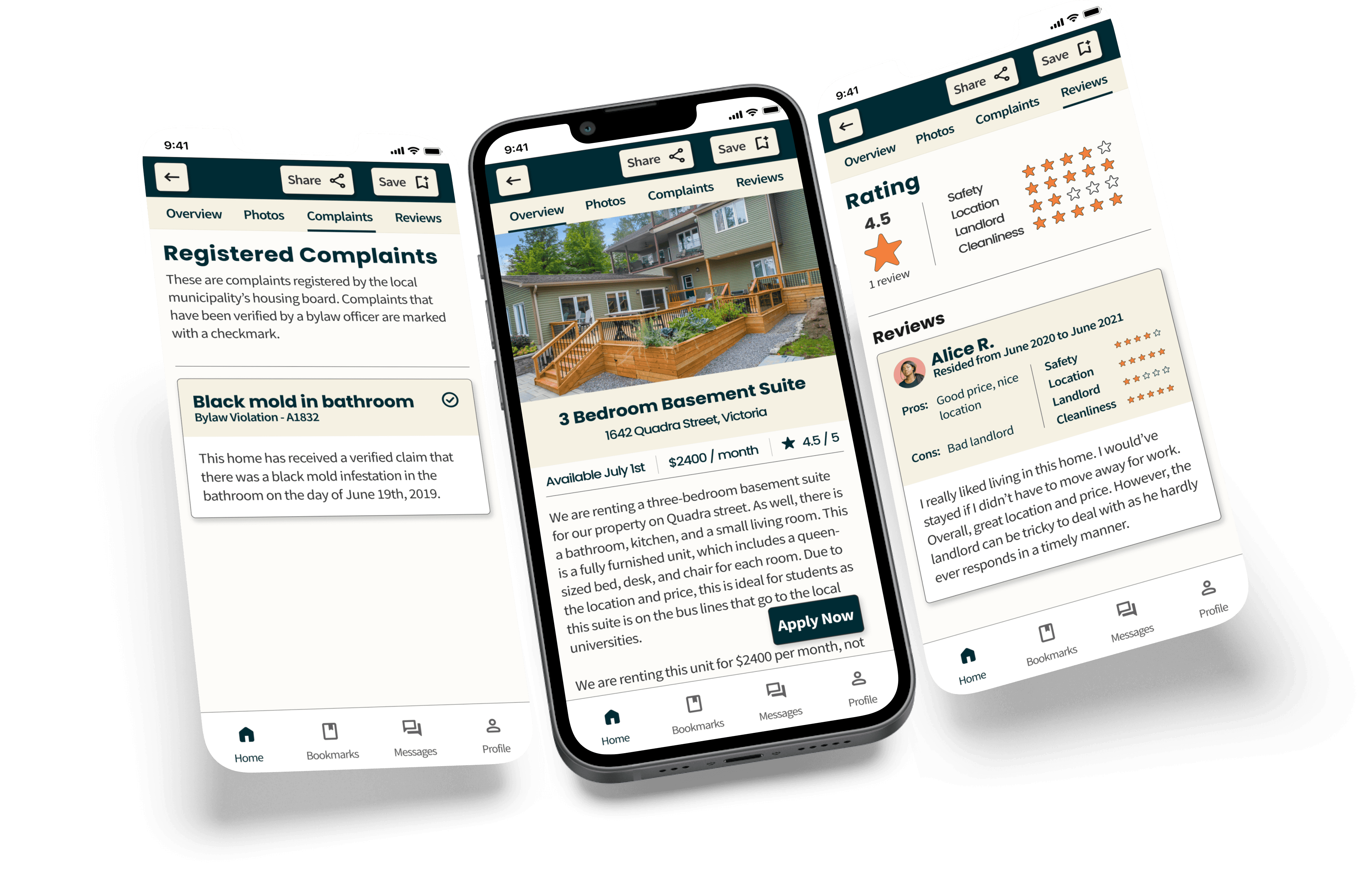
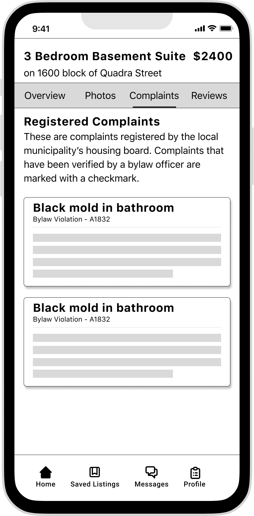
Listing Screen
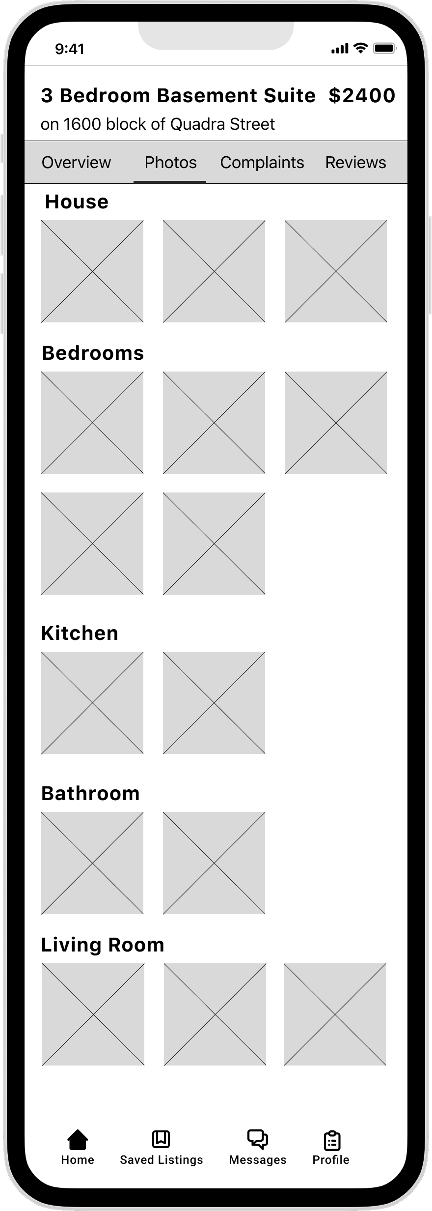
Photos Screen
Complaints Screen
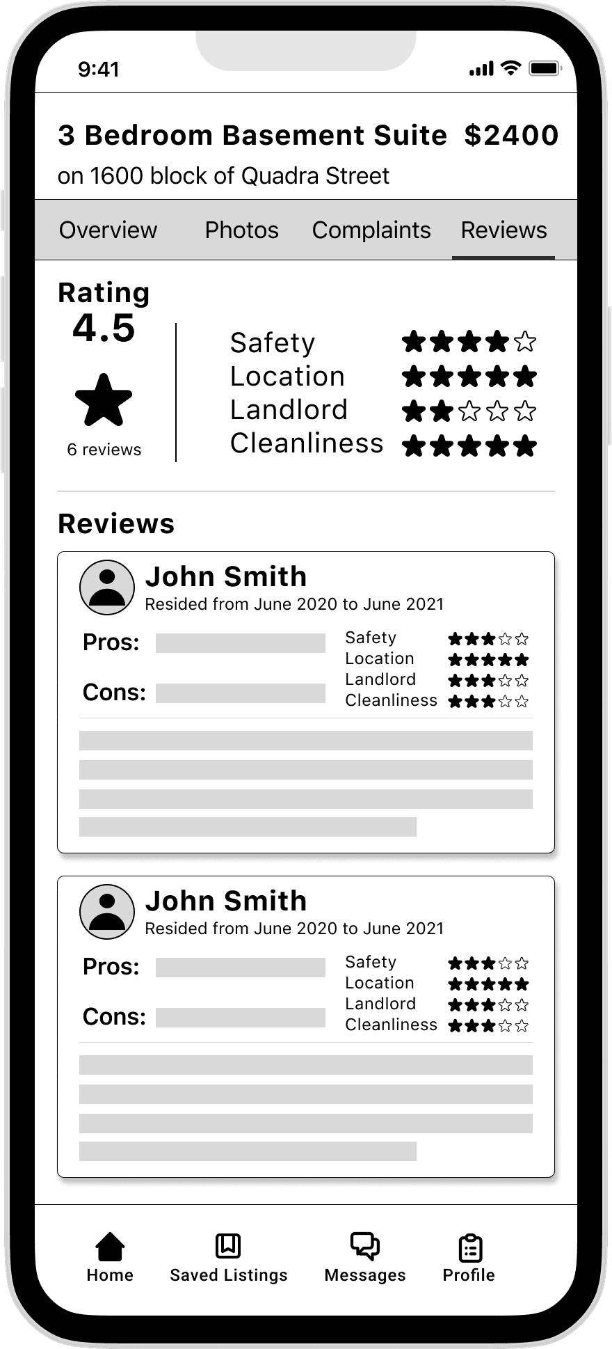
Reviews Screen
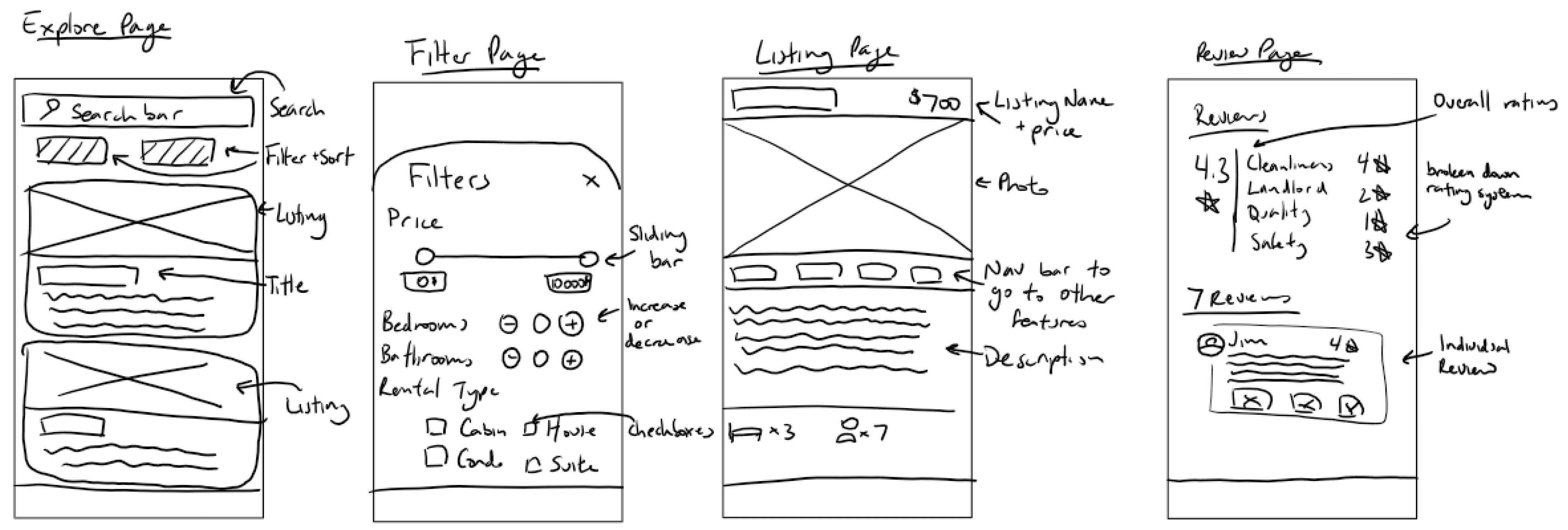
Lo-fi Wireframes
Explore Screen
Filters Screen
The user stories, epic, and task flow help us stay focused on building a solution that’s oriented for Rochelle and her pain points. At this stage, I began to collect inspiration for what the different screens in the task flow could look like.
To view my inspiration board, click here.
Sketches
With my digital pen and tablet, I sketched between three to six different variations of each screen. From there I was able to extract my favourite ideas from the different iterations and create a set of solution sketches.
How might we improve the rental process for young Canadians between 18-25 to help them avoid dangerous living conditions?
How Might We
Problem Space
Major cities across Canada lack adequate housing for their populations. This is especially true for younger people, who are being asked to pay more for less as they move into dangerous, if not downright illegal rental units. By doing so, people are putting their well-being at risk.
Solution
Rented is a mobile app built to help people avoid dangerous living conditions by providing people with the information they need to make better decisions. Our app brings much-needed transparency to our rental markets by keeping things real through user reviews and verified complaints.
I come away from this 12-week program and capstone project with a renewed appreciation for UX designers everywhere. It’s a trade that seems simple at first glance, but gets immensely harder once you actually give it a try. My key learning is that the whole design process is exactly that - a process. There’s going to be highs, and more importantly, lows. That’s what keeps it interesting, because nothing feels more gratifying than overcoming a challenge.
Key Learning
Special Thanks
Special thanks goes out to my interviewees (Kyle, Rebecca & Rory) and testers (Jonah, Rhett, Tabi, Duncan, Andrew, Georgia, Luke, Cressie, Alex & Rory) for being patient with me as I navigated the design process.
Thanks to my classmates (in particular Anjali, Maggie, Michelle and Rajbir), TA’s (Yuri, Elizabeth and Lianette) and teachers (Meade, Noelle and Taylor) who have provided me with support, feedback, and coaching for the whole bootcamp.
When I started this capstone project by choosing a problem space to explore, I had no idea what sort of solution I’d come up with. Rented really addresses the pain points of my initial interviewees and persona. From here, next steps would be to flesh out other in-app features such as applying, profiles, and the landlord UI. Of course, this would also require more research and testing to be done in order to verify that there’s a need for these features. In the meantime, I’m gonna go take a nap.
Future Thinking
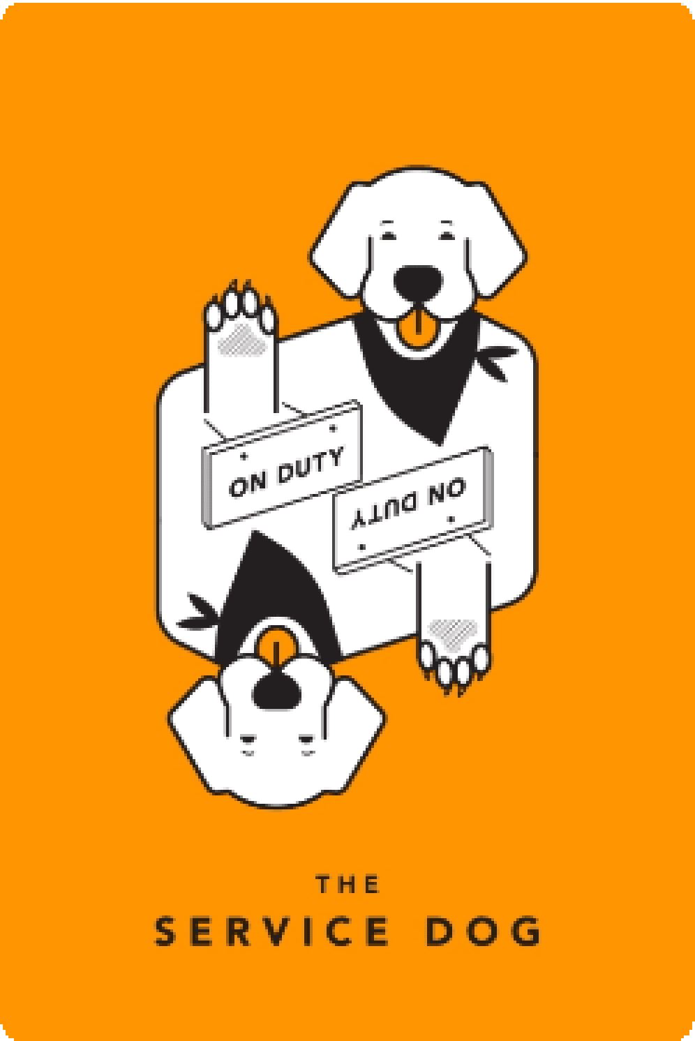
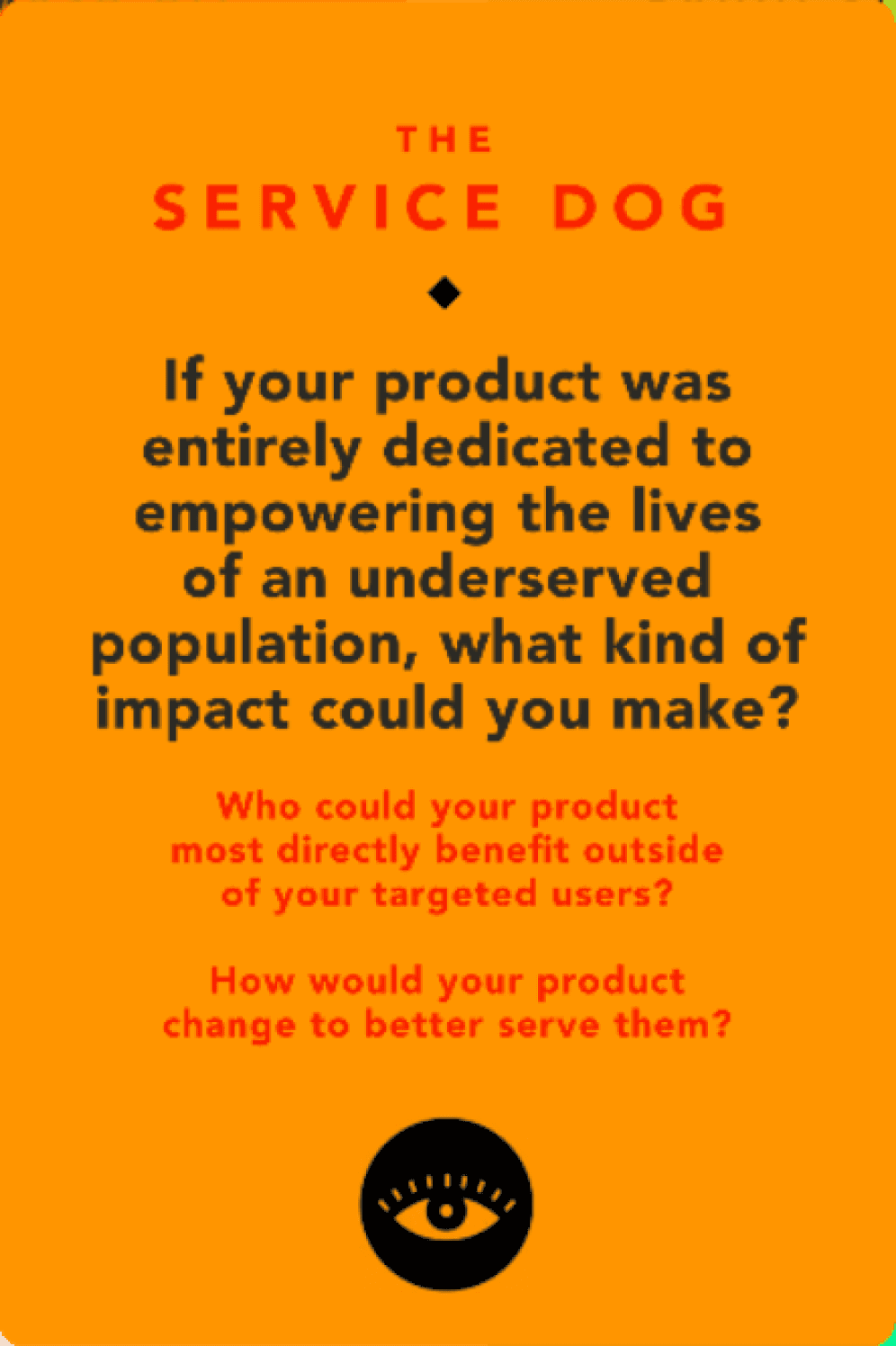
To inspire some more creative thinking, I looked at The Service Dog, a tarot card of tech. It was interesting because I designed Rented to serve underserved populations - young adults and students. However, it made me realize that there are far more underserved populations that could benefit from an app like Rented. In particular, people who rely on social housing as well as foster kids graduating out of the system. I envision Rented being an intermediary to help facilitate conversations between those populations and organizations. There’s a lot of possibilities when I think about the future of Rented.
Tarot Cards of Tech
Thanks for making it all the way to the bottom! Anyway, if you'd like I'd be more than happy to connect and chat about this project. Feel free to reach out on LinkedIn or via email, anything works!
My LinkedIn - Click Here
My Email - davidchan1374@gmail.com